What your online shop really says about your brand
Your eCommerce website is like your home. When guests visit for the first time, what impression do they get? How do they feel upon entering? What catches their attention? How do they perceive your brand? Your website is both your storefront and a reflection of your brand identity. It creates the first impression of you—so how will you ensure it’s a great one?
When visitors land on your online shop, they quickly assess your trustworthiness. Subconsciously, they determine whether the experience makes them feel relaxed and at ease or anxious and uneasy.
I audited three online shops based on my first impressions as a UX and a brand designer. Here’s what I did:
-
As a woman in my mid-30s, I’m looking to elevate my haircare routine. I want a brand I can trust and rely on for years. My ideal shampoo and conditioner should meet my specific hair needs and styling techniques. It should also be natural, easy to use, and require minimal steps.
-
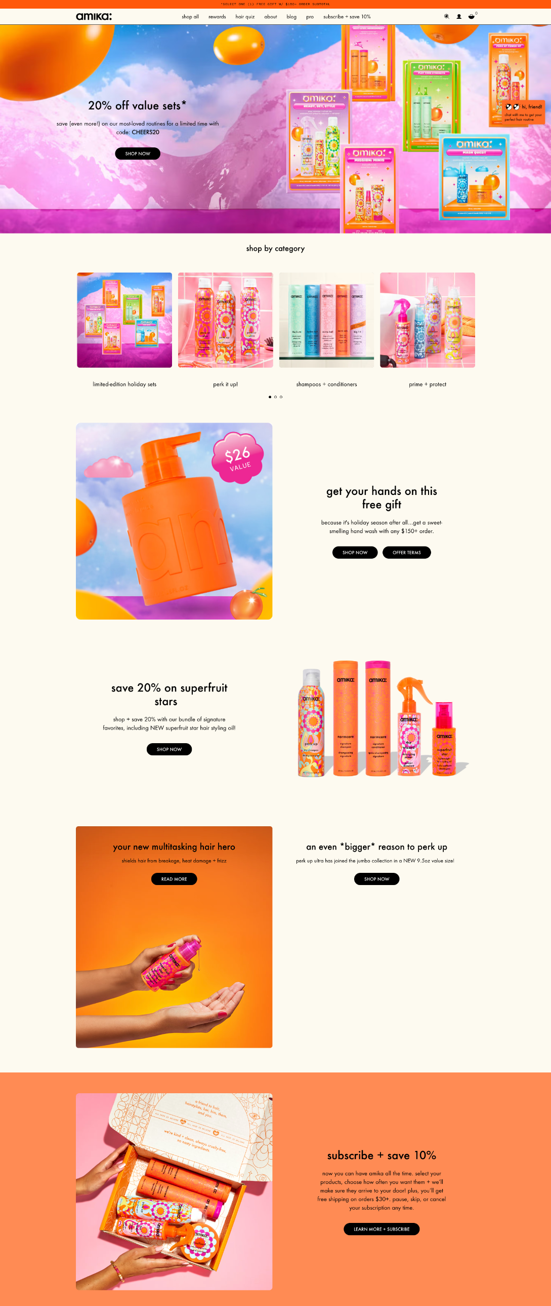
Amika
I discovered this brand while browsing Sephora, which is a plus because Sephora offers hassle-free shipping and accessible delivery. I’ve used Amika products before, so I was curious to explore their current offerings.
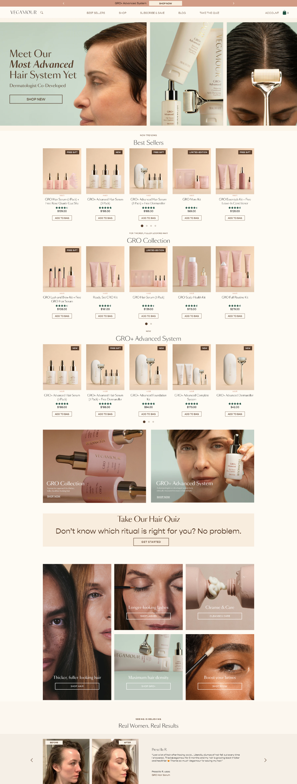
Vegamour
I came across this brand through targeted social media ads promoting hair regrowth. Intrigued by their claims, I decided to learn more.
Prose
I wasn’t familiar with this brand and don’t remember how I stumbled upon it, but I ended up on their homepage.
-
I evaluated the homepage of each website, focusing on the following aspects:
Brand Look and Feel: The visual identity and aesthetics.
Messaging: The clarity and impact of the brand’s communication.
Problem-Solving: The specific haircare challenges they address.
Unique Approach: How their solution stands out from competitors.
User-Friendliness: Ease of navigation and clarity of next steps.
1. Amika
Feels cheap and desperate
Visually, there’s too much happening in the hero section—it feels chaotic, and I’m unsure where to focus.
There’s no clear sense of what makes this product unique.
The page leans too heavily on discounts, with four different promotions visible in just the first half of the page.
My suggestion
Highlight your brand value.
While this is a B Corp-certified company with award-winning products, it doesn’t feel like it. It’s fine to position yourself as budget-friendly, but don’t overwhelm your brand with discounts. Doing so risks undermining your mission and eroding the integrity of your brand. Over time, this could diminish the perceived quality of your offerings.
2. Vegamour
missed opportunity despite an intriguing product
The top half of the page displays too many products with names that don’t convey their purpose. It’s unclear what problems these products are solving, leaving viewers confused.
The sheer number of products shown is overwhelming, and there are too many items to click on. If the audience doesn’t understand what the products are about, how can they make an informed decision to explore further?
My suggestion
Less is more. Focus on identifying the problem and clearly explaining your unique approach to solving it.
Streamline the selection: Display a curated selection of products. Fewer options make it easier for visitors to engage. People tend to avoid making decisions when faced with too many choices. Reducing the cognitive load will create a more inviting experience.
Leverage navigation: The top navigation is the perfect place to showcase your full range of products. Use the homepage to focus on your messaging, value proposition, and why your brand stands out.
3. Prose
a perfect balance!
There’s a lot to love here:
The hero section features a visually appealing video showcasing the product, consumers, and ingredients.
Right away, it’s clear that customization is a key part of their value proposition.
With minimal scrolling, I quickly learn that the brand uses healthy ingredients to create customized formulations.
The brand feels personal, making me feel understood and valued. Their products stand out as unique, steering away from the cookie-cutter approach most brands take.
My suggestion
I initially thought they offered a default product line alongside customizable options due to showing many finished-looking products.
While I prefer their customization-first approach, this wasn’t clear until I saw the questionnaire. You could solve this with a visual of an unfinished bottle, or a blank bottle to imply that it’s customizable.
Takeaways
Although I was a returning customer of Amika and intrigued by the Vegamour ads, I ultimately chose Prose as my new haircare brand. This highlights an important truth: a great product and compelling marketing can only take you so far.
First and second impressions matter. Don’t underestimate the power of your online shop—it reflects who you are, what you offer, and how you’ll support your customers over time. It serves as the window into how the world views your brand and sets the tone for how consumers perceive you for years to come.
A great first impression will:
Be clean and minimal, with ample white space to allow the eyes to rest and focus on visually engaging content.
Spark intrigue, encouraging visitors to scroll naturally.
Look modern and evoke positive emotions.
Present a single clear purpose and action, with all other clickable elements playing supporting roles.


