mega Menu mistakes
The main menu is arguably the most important part of your online store. Think of it as the guide for your visitors, much like signs in a grocery store. Its role is simple but crucial: helping customers access your products. Is your menu intuitive? Can visitors quickly find what they’re looking for? Can they navigate seamlessly without feeling lost?
In this article, I’ll discuss common menu mistakes that show up repeatedly. The good news? They’re all easy to fix!
meet expectations
Your menu needs to work—sounds obvious, right? But this issue crops up more often than you'd think. Mega menus, those large dropdowns designed to neatly organize your products, can be incredibly useful. They allow visitors to locate items quickly and efficiently.
However, they can also be a source of frustration. For example, if a visitor hovers over a mega menu to select a specific category and the entire menu vanishes before they can click, it creates a poor experience. When this happens repeatedly, it’s easy to see why someone might leave your site in frustration.
Take The Body Shop, for instance: navigating their “Makeup” dropdown took me 28 seconds just to select a page.
Why it matters: Research shows that users have little patience for frustrating experiences. Studies reveal that many users will abandon a site within 15 seconds if they encounter difficulties. Even worse, if they can’t quickly find what they need, they’re likely to leave entirely. It’s no surprise that average bounce rates hover around 50% for many websites.
By addressing common menu mistakes, you can provide a smoother, more enjoyable shopping experience for your visitors—and keep them coming back.
visual guidance
If your menu contains a mix of dropdown items and non-dropdown items, it’s essential to clearly distinguish between the two. A simple way to do this is by adding a chevron icon next to dropdown menu items. This small visual cue indicates that the item can be expanded. Without it, users may assume something is broken or missing when nothing happens.
For instance, in the Girlfriend Collective example, I initially thought the "Sports Bras" category was malfunctioning because no dropdown appeared when I hovered over it.
Users have specific expectations when navigating a website. If these expectations aren't met—whether due to unclear navigation or elements that don’t respond as expected—they quickly become frustrated. In many cases, this frustration leads to them abandoning the site entirely rather than persisting through a poor experience.
By providing clear visual guidance, you can help users navigate your menu effortlessly and avoid unnecessary confusion.
Solution 1
One option to solve this problem could be to simply add a chevron to the dropdown items only
Solution 2
Another way to solve this problem would be to add dropdown menus for ALL menu items. IMO it’s better to be consistent, then have only one outlier. I noticed that “Dresses & One Pieces” only has one dropdown item, so maybe “Sports Bra” can follow the same consistency:
Use button states
Buttons typically have three distinct states: resting, hover, and active. Each state plays a crucial role in improving navigation and user experience.
Resting State: This is the default appearance of the button when no interaction is taking place.
Hover State: This state appears when a user hovers their mouse over the button, providing visual feedback. (Note: This applies only to desktop, as mobile devices do not support hovering.)
Active State: This state shows how the button looks after being clicked.
The active state is often the most overlooked but arguably the most important. It serves as a "breadcrumb" for your website, letting visitors know exactly where they are. This feature becomes even more critical as your site grows with additional products and categories. By using active states effectively, users can navigate multiple pages and easily find their way back to the top-level menu.
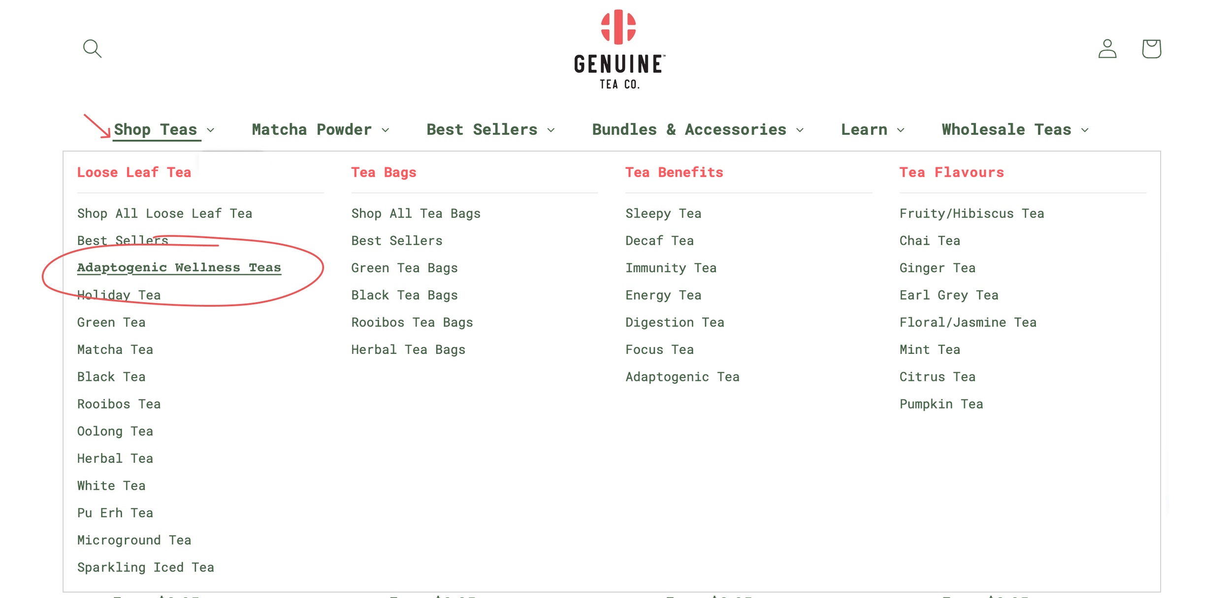
Take Genuine Tea’s menu as an example. With numerous products and categories, there’s no clear indication of the selected product category. Neither the menu nor the dropdown highlights the current section. Additionally, the page itself lacks a visible title, making it difficult for users to identify their location.
By implementing clear active states, you can eliminate confusion and create a smoother, more intuitive browsing experience for your visitors.
Solution
Add a visual cue to indicate what is “active”. Maybe the main menu can have a bold underline that remains static once clicked. The dropdown menu can have the same visual cue. This consistency lessens the cognitive load and removes any guessing of what section they’re in.
Takeaways
Don’t underestimate the value of your menus. User frustration can manifest quickly, often within seconds of encountering problems like unclickable buttons. Ensuring a smooth and responsive user experience is crucial for retaining visitors and preventing them from leaving out of frustration or confusion.


