Nanny lane brand
2018
Making childcare more affordable and seeking to create a supportive network for families navigating the complexities of childcare in today’s economy.
Nanny Lane is an online marketplace for finding, hiring, and managing a nanny or nanny share.
My Impact
In addition to designing and launching the entire product experience from scratch, I also conducted design sprints to create the visual identity. That included the logo, brand strategy, illustrations, brand guide, and all supporting ads and graphics.
brand platform
Rational difference
A free platform to help make the process of finding and handling payments for childcare simple and effortless. We are the full package: find, hire and pay.
Emotional difference
Nanny Lane was created to put kids first by hiring a positive role model for them with similar values.
Brand essence
We're dedicated to adding simplicity and support to families and nannies. We bring people together by cultivating relationships within communities that grow beyond our product experience.
Philosophy
Nanny Lane is more than just hiring a nanny, scheduling time tables and sending paychecks. It's about finding the right lifestyle fit, sharing similar values, and fostering growth in children.
We believe nannies are educational leaders and strong individuals who help shape a child's life.
Language & Principles
Clear and accessible
People using Nanny Lane will be of all different levels of technical understanding, so we need to write for the least-savvy in a way that isn’t patronizing. We ensure people have proper expectations of the product, flows, next steps and each other.
Concise
Less is more. People generally skim content, so the less words we use, the less there is to miss.
We aim to set expectations so that people know exctly what will happen on the next screen. This includes clear and concise CTA language.
Trustworthy
The prospect of using a new service can be daunting - even moreso when a person’s kids are involved. At every step of the way, we need to make sure that we’re adequately explaining things that need explaining, and making it clear that we will safekeep their personal information.
Colours and gradients
Nanny Lane colours are soft pastel-like hues, and when combined, form Nanny Lane gradients. The pastels are never used on their own. They only exist in illustrations and in the app.
Gradients are a big part of the Nanny Lane brand. The inspiration comes from old analog photos of light leak and muted hues, creating a nostalgic feeling millennials get from their childhood.
We have three different gradients that are specific to each type of person on the platform: the Family, the Nanny and the Nanny Share. Each person’s interface is skinned with the corresponding gradient background.
Gradients are only used as backgrounds that cover large surface areas (with few exceptions).
Illustrations
Nanny Lane has two types of illustrations:
Top view illustrations are usually objects you would find on a desk. The point of view is from the top looking down as if the objects were laid out or scattered across a desk. These are mostly found on Nanny Lane landing pages.
Landscape view illustrations consist of our Nanny Lane characters. They are used inside the product and pop-up in places to help guide people through a flow or just congratulate them at the end of one. They are drawn from a portrait perspective, always have a base line and sometimes background elements.
Creating & using illustrations
Top view
Illustrations that include a sheet of paper do not have a border and instead use a shadow.
All individual objects in an illustration have a shadow with the following specs: X=2 / Y=2 / Blur=4 / Opacity=30%
They always sit on a white background
Landscape view
They never have shadows because they are 2-dimensional
They are always anchored by a horizon line in the background that sits about 25% above the base of the illustration.
They should always sit on a white background. The only exception is on empty state dashboards, where they sit on a gradient background. However, these use very minimal colour so it doesn’t clash with the gradient background.
Photography
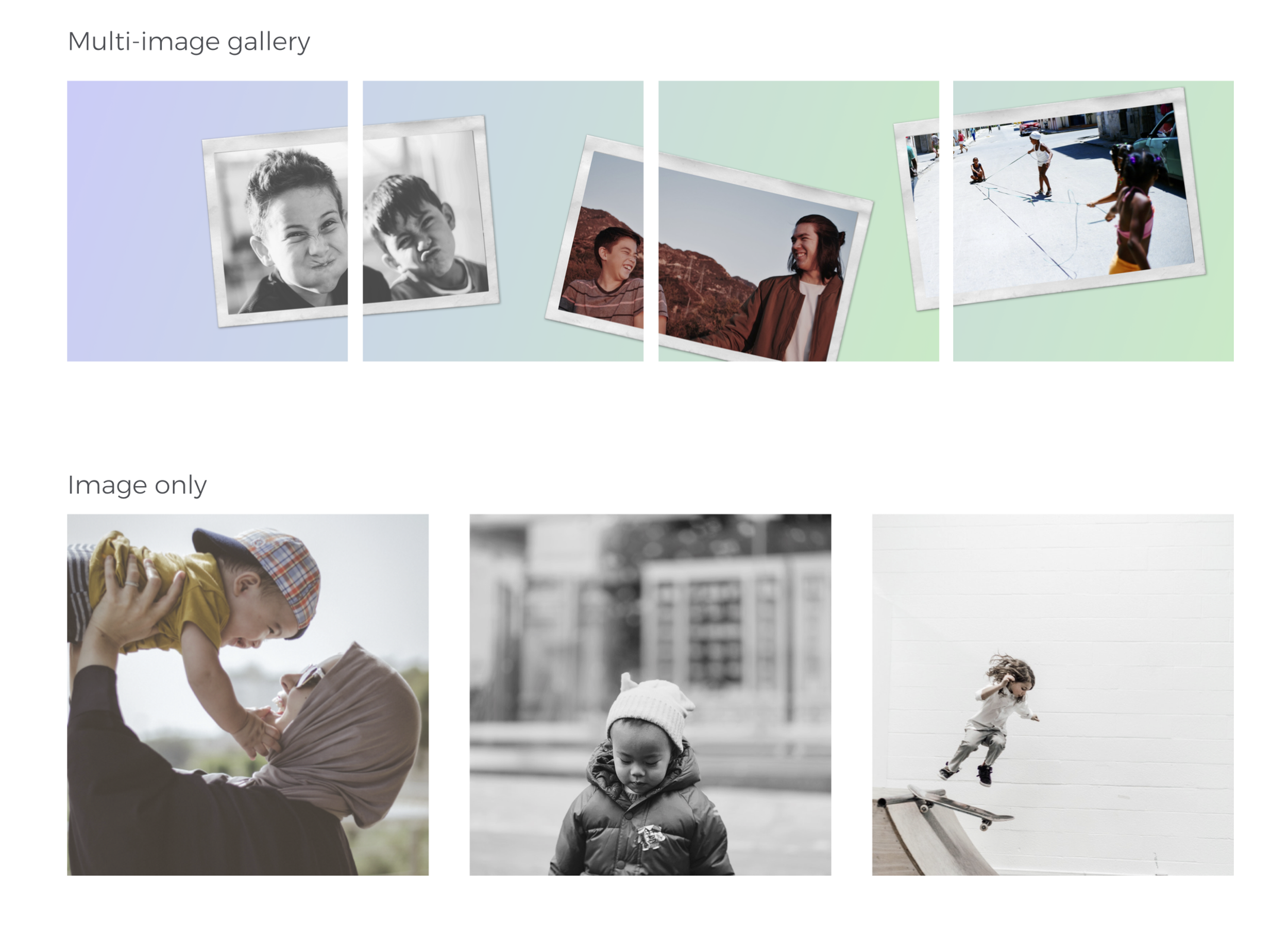
Photography used in Nanny Lane mimics a nostalgic style. We use black/white and soft tone photos. The inspiration comes from old analog pictures, and the candid moments we remember when looking back at childhood photographs.
The subjects in Nanny Lane photography are very candid, natural and playful. They are never forced and they never pose looking directly at the lens.
Nanny Lane welcomes everyone. We highlight the importance of having diversity on our platform that reflect the real families and nannies living in our communities. Diversity is crucial throughout Nanny Lane product and photography.
Social Media
Honest
Honestly is the best policy. People value brands that are honest and transparent. We are people too. We should make others feel as though they are engaging with real people, by being authentic and genuine.
Relatable
Some of us are parents, some of us hired a nanny or grew up with a nanny, but all of us have families and friends we adore and look after. We understand busy schedules, looking after loved ones, every-days stressors, adapting to new environments and creating new relationships. The Nanny Lane team is made up of diverse and humble individuals, who all have different experiences and a unique story to tell. We understand our audience and want them to know that we are just like them.
Light-hearted
While Nanny Lane works hard to provide people with the comfort and expertise in our product, we never take life too seriously. We appreciate the small things in life, we can laugh at ourselves and enjoy eachothers company.


